

VELA is a mobile application designed for water sports enthusiasts that was part of my UX Design Course at CareerFoundry. I designed the app from start to finish through research, analysis and best practices in UX Design.
6 months
Spending a day on the water can quickly turn from fun to dangerous if forecasts are misunderstood. In order to stay safe and have a good time at sea, it is crucial that water sport enthusiasts have access to easy-to-understand information regarding weather and water conditions.
However, weather data can be complex and, especially for beginners, it is not always clear which data are relevant for their water sport and how to read the weather reports.
For this project, my role was to create a weather app which provides beautifully displayed and easy to understand information about weather and water conditions for water sport enthusiasts by applying Design Thinking, Iterative Design and Human
Centered Design Strategies.

I conducted a competitor analysis with two competitors, Windy and Nautide. I created SWOT profiles for both apps and a UX analysis for Nautide to understand what type of problems users face with competitors’ products and to highlight opportunities to meet an unfulfilled user need.


With the goal to find out more about the behavior & habits of water sport enthusiasts and to discover user needs which are not satisfied by existing apps, I conducted user surveys with 45 water sport aficionados of all skill levels. This information helped me to prepare for my user interviews because it already gave me an idea about habits and priorities of users.


After gathering the information, I created an affinity map to help me structure my findings and identify key statements and challenges.


The creation of user personas followed the analysis of the previously gathered data. Their main function was to assist and direct efforts towards refining VELA as to allow it to more effectively meet the personas’ needs.

To visualize how the personas would interact with my app and to see VELA from their point of view, I set up user journeys simulating a specific persona’s needs, emotions and thoughts.

For each persona task analyses and user flows were developed to present the steps users would have to take within the app to navigate and reach their goals. A practical step by step visual of the app’s structure from a user’s perspective giving valuable insight on VELA’s actual usability and effectiveness.

Three core needs emerged from my research and became the guiding principles in VELA’s development.
Users expressed great interest for an app that is fast and easy to use. Therefore, a lot of effort went into reducing the number of required steps to navigate and access information as well as creating a structure that is visually intuitive and supported by icons.
Interviewing water sport enthusiasts brought to light a need for personalization options.
Most notably, I wanted to allow users to edit which reports are displayed in the summary page as well as having access to a whole section dedicated to setting preferences and default settings.
Users showed a clear and crucial need for reliable forecasts.
Having VELA gather reliable data from the best weather models and having the option to access more detailed reports as well as local weather predictions were determined to be essential.

Having these main features in mind, I conducted a card sort to get a better idea how users might expect my app to be structured and based the creation of my sitemap on the results.


After defining the sitemap, I created low-fidelity wireframes to start testing VELA’s functionality and its core guiding principles in practice. Instead of pen and paper, I decided to use an erasable smart notebook that allowed me to instantly store my notes. By visualizing the different user flows, such as adding a location to get to see the weather data for that location, I was able to check if the user flow was intuitive and to ensure that it helped the user reach their goals quickly and easily. I went through several iterations learning to apply material guidelines and consistency.

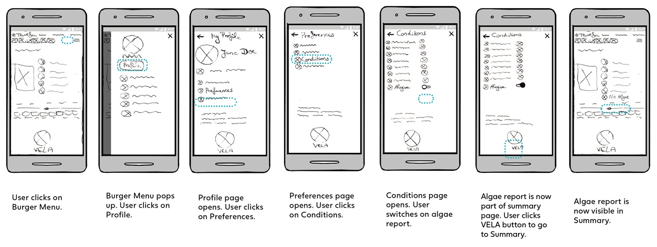
Next came mid-fidelity wireframes followed by high-fidelity wireframes and a clickable prototype in Adobe XD for usability tests.

Conducting usability tests gave me the opportunity to see how the users interacted with VELA, to test if my design meets the users’ needs and to reveal any possible shortcomings of my design. For VELA’s test sessions I found 6 participants who practice different water sports at different skill levels (beginner - advanced). To analyze the results, I used affinity maps and rainbow spreadsheets.


VELA underwent several iterations based on the user feedback received during the usability tests. I also conducted a preference test with 10 participants through Usability Hub which lead to further changes of my high-fidelity wireframes.
I also learned to apply Gestalt Principles, Emotional Design and grids to organize the content and elements of my wireframes which helped me further improve the design of my app.


After learning about accessibility guidelines, I made further changes to my prototype.
The color of the text in the search button was too low in transparency and hard to read. Therefore, I increased transparency.The color of the icons and text in the scrollable menu was changed to ocean blue and the background color was made less visible in order to increase readability. The text of the articles was moved to the top and the background image repositioned so that the text is easier to read.

At first, VELA only included placeholders on the login and sign up screens to indicate what the user should type. There was no indication for the user to see which input field they were finding themselves in.Therefore, I added a text cursor for when the user is typing. When text has been entered in the field, the border of the form field changes to blue and a label is visible on top of the field to tell users what the corresponding input fields mean.

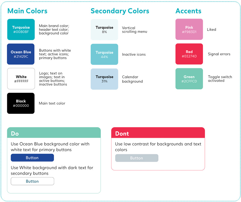
Lastly, I created a Design Language System to help maintain consistency throughout the app.
Click here to view the full document.

Following the established core principles, VELA’s final version comes with three main defining features.
Can I go surfing today? Being able to answer this with a single click is one of VELA’s main features. Launching VELA will load the summary page with all essential data and a thumb icon instantly notifying the user if the weather conditions are favorable or not.
VELA’s fulcrum is the summary page. It displays all the essential data relevant to your water sport. The page can be customized to meet varying needs and preferences.
VELA features real time detailed weather reports and reliable forecasts. Based on several of the main weather models such as ECMWF & GFS, the data presented is accurate and always kept up to date.
Click below to view a video demonstration of the app.
Click here to view the final prototype.

Creating a competitive weather app when well established ones already exist was a challenge that led to opting for a water sport specific niche solution. I tried to look at the project from unconventional perspectives and put great focus on revolving ideas around users’ needs. Most notably, it was the usability tests that allowed me to refine the app. How to improve its structure, how to make it as intuitive as possible and how to present in a clear and effective way what is often viewed as complex and confusing weather data. Principles like the 1 click away answer and returning control to the user, guided me through a creative process that resulted in an app that offers a unique set of features and that is able to be competitive on the market.
Working on this project was a great experience that allowed me to put into practice a set of core UX guidelines and to learn a variety of valuable new skills.
If you would like to get in touch,
you can contact me here